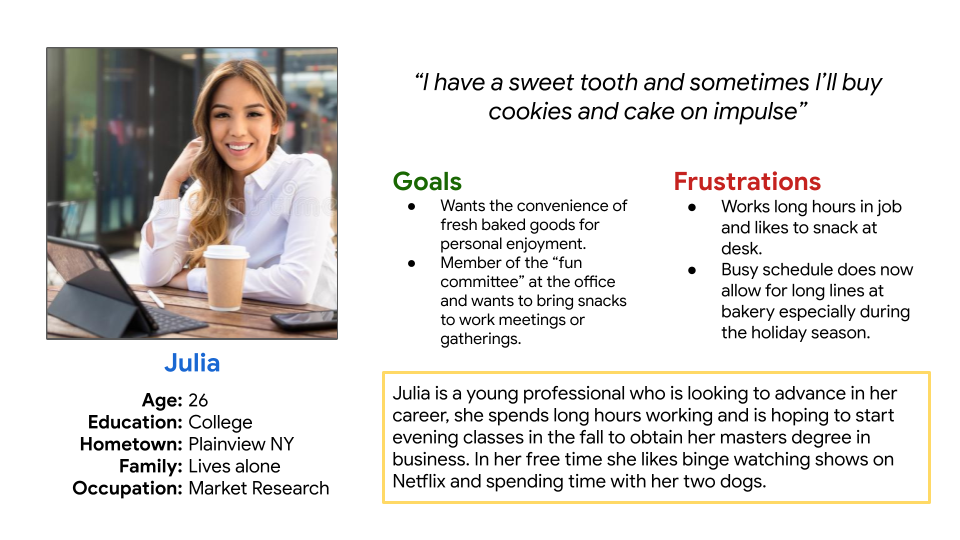
1
2
3
4
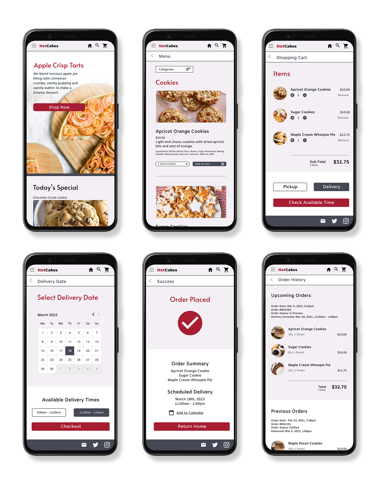
Julia is a young professional who needs the ease and convenience of ordering and having a delivery of baked goods online because of her busy schedule.
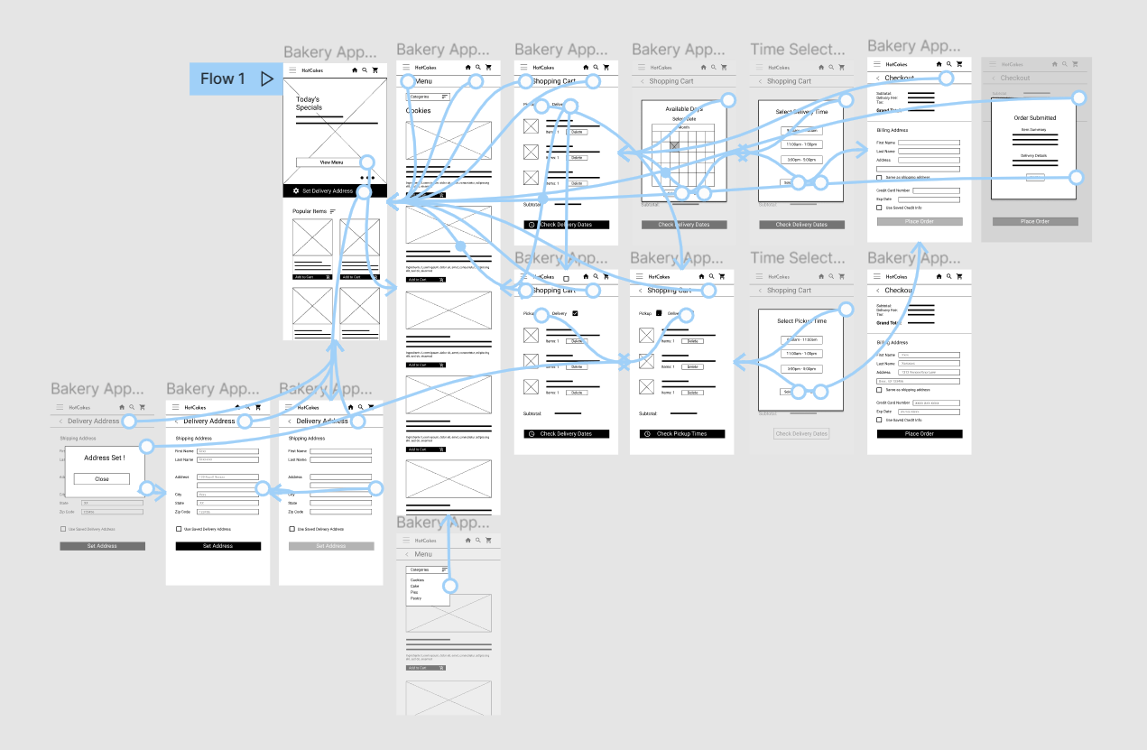
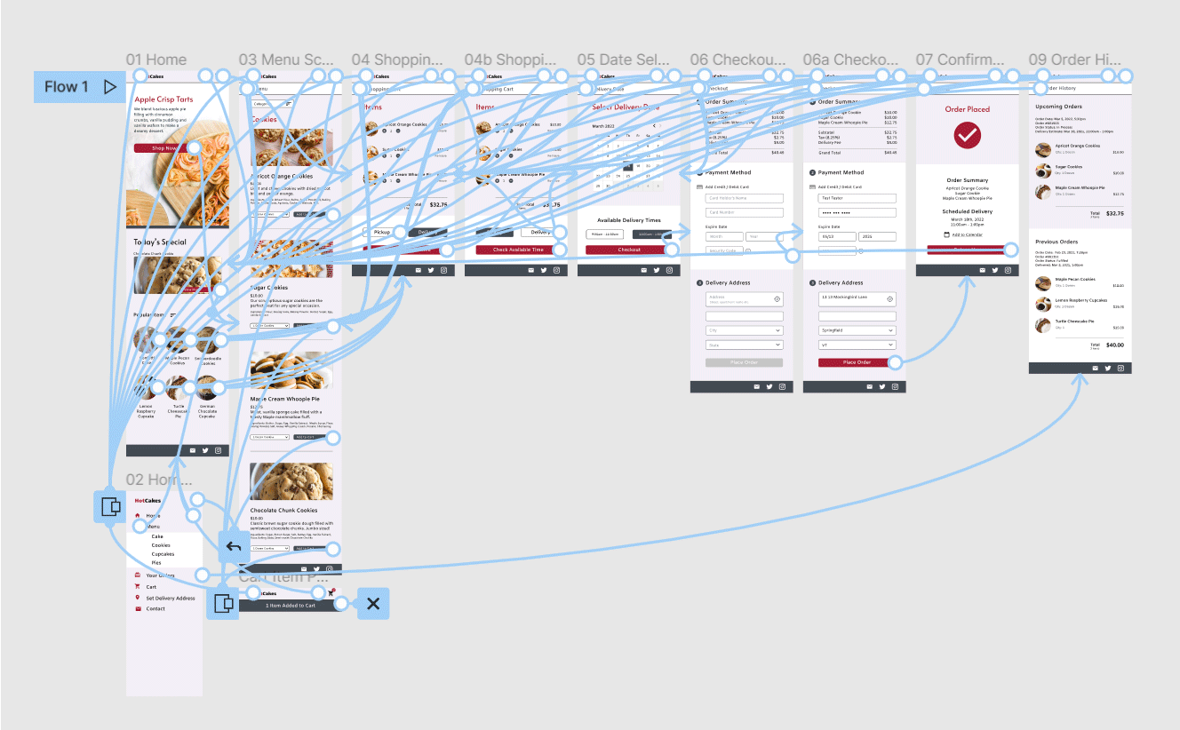
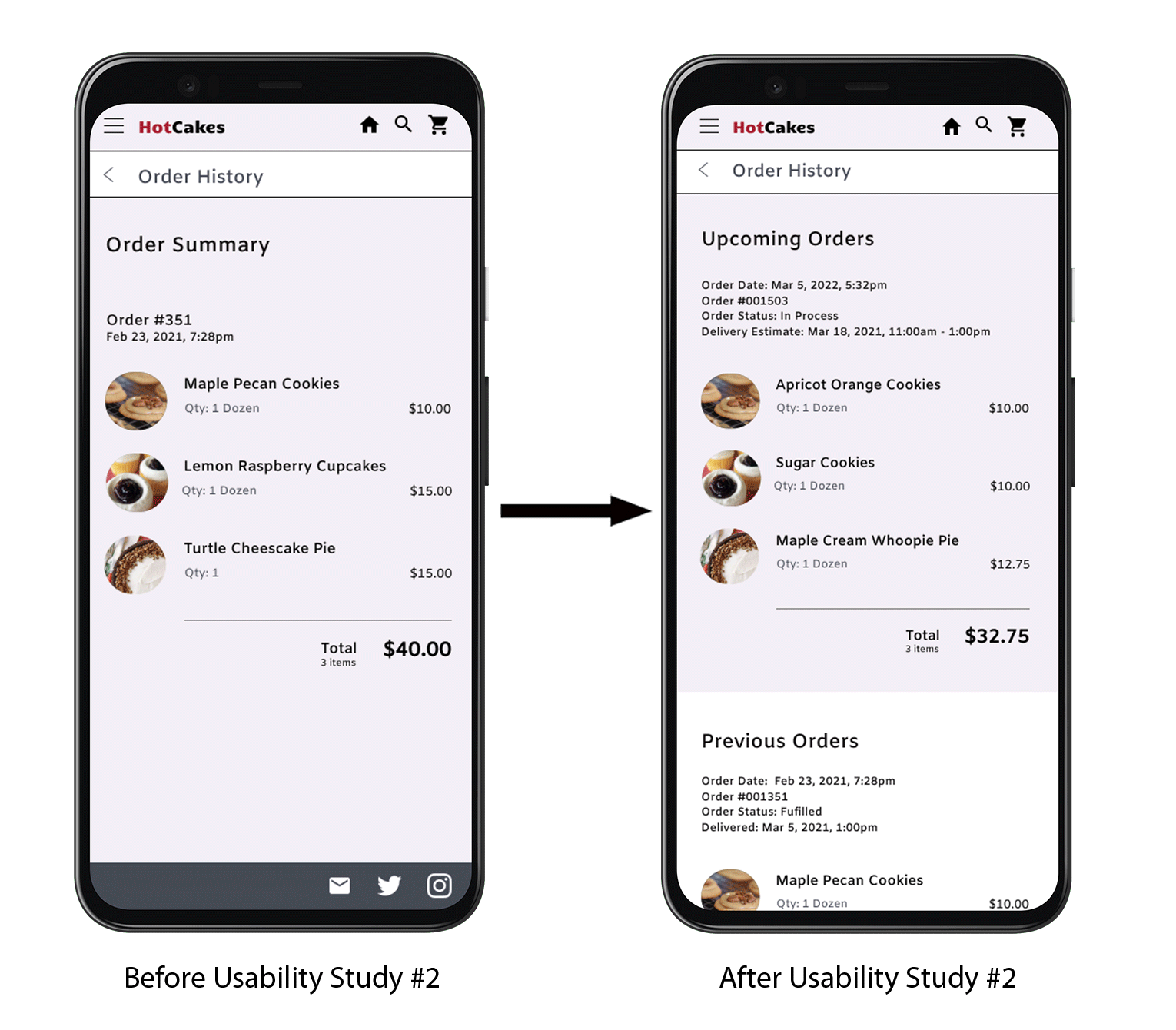
Mapping Julia’s journey revealed some of the problem points and potential solutions users would experience when ordering through the app.
View User Journey Map →Taking the time to draft iterations of each screen of the app on paper ensured that the elements made it to digital wireframe would be well suited to address user pain points. For the home screen I wanted to highlight options to make the ordering process as easy as possible for the user.
As the initial design phase continued, I made sure to base screen designs on feedback and finding from user research.
My goal was to make the decision making process as easy as possible to the user. Providing a sorting function as well as images and enticing descriptions.
The low fidelity prototype connected the primary user flow of ordering from the menu and then selecting pickup or delivery options. This prototype was created to be used in a usability study. View the low-fidelity prototype→
1
2
3
1
2
3
Early designs had smaller images and limited information about the items and the existing items in the cart. Based on user feedback I have fleshed out the information displayed on the menu page, in addition I have added an item counter and a small popup when an item has been added to the cart.
Users noted they wanted a place to look up information about the order after it was placed, in addition it was noted that the order summary page lacked clarity. Information about any active orders was added to the order history page and clarifying verbiage was added to the page.
The final high fidelity prototype presented a clean user flow while allowing redundant means of navigation to several key points in the flow. View the High Fidelity Prototype→
We have created a modern and intuitive app which allows people to effortlessly place an order for their favorite dessert item.
One quote from peer feedback: “The app was really easy to use and now I really want cookies!”
I was surprised by some of the results of the usability studies for this app, users would often discover issues I was completely unaware of For example I found people wanted more information at the tips of their fingers rather than going through the effort to seek it out.